Data Visualization Overview
From Data to Decisions
Raw numbers are inert. A table of 10,000 pageview records tells you nothing until a human brain processes it, and that volume is simply too much. Fortunately, human brains process visual patterns orders of magnitude faster than they read rows and columns of numbers. Visualization is the bridge between collected data particularly at scale and human understanding.
The Behavioral Analytics overview covers what to measure and why. The Analytics Overview covers how to collect it. This page covers the last mile: how to turn that collected data into charts, dashboards, and presentations (often called stories) that enable decisions. It is also about doing this honestly, because visual encoding choices can not only reveal the truth but also conceal it.
If you are building the course dashboard project, this page provides the conceptual foundation for the visualization choices you will make there.
1. Why Visualize Data?
The human visual system processes spatial patterns in roughly 200–500 milliseconds — far faster than reading a table of numbers. This is not a minor efficiency gain; it is a qualitative difference in what the brain can discover. Trends, outliers, clusters, and gaps that are invisible in a spreadsheet become obvious in a well-chosen chart.
Also, practically, consider scale. A table with 10 rows is readable. A table with 100 rows is tedious. A table with 10,000 rows is useless without aggregation or visualization. The datasets our analytics pipeline produces are routinely in the tens of thousands of rows. Visualization is not a nice-to-have; it is a necessity.
The most famous demonstration of this principle is Anscombe's Quartet (1973) — four datasets that are statistically identical (same mean, same variance, same correlation, same regression line) but look completely different when plotted:
The lesson: summary statistics can hide radically different data structures. Plotting the data reveals what the numbers conceal. This remains one of the most powerful arguments for visualization — and it was made over fifty years ago.
2. Visual Encoding: Mapping Data to Marks
Every chart is a mapping from data values to visual properties. The data value "42 pageviews" might be mapped to the height of a bar, the position of a point, or the saturation of a color. This mapping is called visual encoding, and it is the fundamental building block of all data visualization.
Jacques Bertin formalized this idea in Sémiologie Graphique (1967), identifying the core visual channels available for encoding data:
| Visual Channel | Best For | Accuracy | Example Chart |
|---|---|---|---|
| Position (x, y) | Quantitative | Highest | Scatter plot, line chart |
| Length | Quantitative | Very high | Bar chart |
| Angle / Slope | Quantitative | Moderate | Pie chart, line slope |
| Area | Quantitative | Low | Bubble chart, treemap |
| Color hue | Categorical | N/A (categorical) | Colored scatter, legend groups |
| Color saturation / lightness | Quantitative (ordered) | Low | Choropleth map, heat map |
| Shape | Categorical | N/A (categorical) | Scatter with different point shapes |
The key insight is that not all channels are equal. Some channels encode quantitative data with high perceptual accuracy (position, length), while others are much less precise (area, color saturation). Choosing the wrong channel for your data type is one of the most common visualization mistakes.
3. Decoding: Perception & Accuracy
If encoding is the chart-maker's job, decoding is the chart-reader's job — extracting the data values from the visual marks. The critical question is: how accurately can a human decode each visual channel? This is not a matter of opinion; it has been measured empirically.
Cleveland and McGill (1984) published a landmark study ranking perceptual accuracy across visual channels. Their hierarchy, from most to least accurate:
The rough original image is provided here showing from top to bottom the degree of accuracy in decoding the difference of two encoded values.
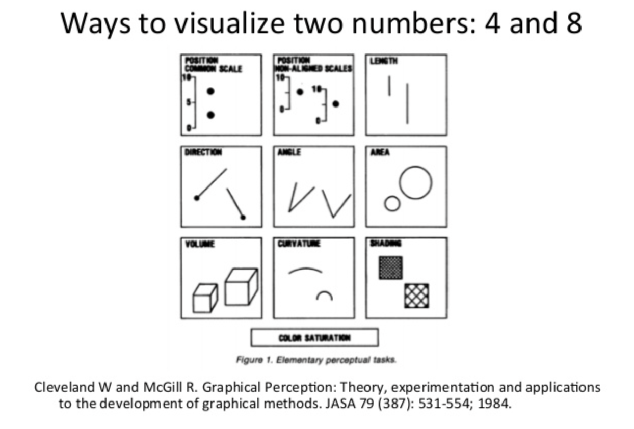
Instead of this potentially confusing diagram, let's use a revised way of decoding with a bar chart!
This ranking has been replicated multiple times, including by Heer and Bostock (2010) using crowdsourced experiments on Amazon Mechanical Turk, confirming the original findings. The practical consequence is straightforward: bar charts are not "better" than pie charts because of aesthetics — they are better because humans decode length more accurately than angle. This is a measured, empirical fact.
Interactive Demo: Perception in Action
The same data — pageviews for five pages — rendered as a bar chart and a doughnut chart. Try to rank the values from largest to smallest using each chart. Notice which one makes it easier:
With the bar chart, the ranking is immediate: you can see the differences in length at a glance. With the doughnut, you can identify the largest and smallest slices, but ranking the middle three requires more effort — and you are more likely to get it wrong. This is exactly what Cleveland and McGill measured.
4. Exploratory vs. Explanatory Visualization
Visualization serves two fundamentally different purposes, and conflating them is one of the most common mistakes in analytics work:
| Dimension | Exploratory | Explanatory |
|---|---|---|
| Purpose | Discover what you don't know | Communicate what you do know |
| Audience | You (the analyst) | Others (stakeholders, team) |
| Volume | Many charts, most discarded | Few charts, carefully chosen |
| Polish | Messy, fast, disposable | Clean, labeled, annotated |
| Interaction | Filter, zoom, pivot freely | Guided narrative or fixed view |
| Tooling | Notebooks, ad hoc scripts | Dashboards, reports, presentations |
| Risk | Missing an insight | Miscommunicating an insight |
Exploratory visualization is like prototyping and drafting: you make dozens of charts quickly, looking for patterns, anomalies, and correlations. Most of these charts will be dead ends — that is the point. You are searching for the signal.
Explanatory visualization is like publishing: you have found the signal, and now you need to communicate it clearly to someone else. This requires annotation, context, labeling, and deliberate encoding choices.
5. Charts as Agreed-Upon Conventions
A chart is not just a visual encoding — it is a shared visual language. When you draw a bar chart, every viewer already knows the convention: the x-axis is categories, the y-axis is a quantitative scale, and the height of each bar represents the value. You did not invent this convention; you inherited it from roughly 240 years of practice.
Understanding where these conventions came from helps you understand why breaking them is dangerous:
Each of these milestones established conventions that viewers now take for granted. When you put time on the x-axis and a quantity on the y-axis, you are following Playfair's 1786 convention. When you use a box plot to show distribution, you are following Tukey's 1977 convention. Breaking convention is not inherently wrong, but it forces every viewer to re-learn the visual language before they can read the data. That cognitive cost should be paid only when the payoff is significant.
6. Chart Type Inventory
There is no "best chart." The right chart depends on the question you are asking. Organizing chart types by analytical question — rather than by appearance — makes the selection process straightforward:
| Question | Chart Type | Best For | Watch Out For |
|---|---|---|---|
| How do categories compare? | Bar chart | Comparing values across discrete categories | Too many bars (>15) become unreadable |
| Grouped bar | Comparing sub-categories within categories | More than 3–4 groups per cluster becomes confusing | |
| Lollipop | Same as bar but with less visual weight | Less familiar to some audiences showing the cultural nature of viz as they used to be common | |
| What are the parts of a whole? | Pie / Donut | Showing a single dominant proportion | More than 4–5 slices becomes unreadable |
| Stacked bar | Parts-of-whole across multiple categories | Interior segments hard to compare across bars | |
| Treemap | Hierarchical part-to-whole with many items | Small rectangles become illegible; area decoding is imprecise | |
| How is data distributed? | Histogram | Distribution shape of a single variable | Bin width choice changes the story |
| Box plot | Comparing distributions across groups | Hides multi-modality; requires statistical literacy | |
| How does a value change over time? | Line chart | Continuous trends | Too many lines overlap; use small multiples instead |
| Area chart | Volume / magnitude over time | Stacked areas distort upper layers | |
| Sparkline | Inline trend within text or table | No axes — shows shape, not value | |
| What is the relationship between variables? | Scatter plot | Correlation, clusters, outliers | Overplotting with many points |
| Bubble chart | Scatter + third variable as size | Area encoding is imprecise (see Section 3) | |
| What is the current status? | Gauge | Single KPI against a target | Takes a lot of space for one number |
| KPI card | Single number with trend arrow or sparkline | No context without comparison period |
7. Client-Side vs. Server-Side Charting
When building a web-based analytics dashboard, a fundamental architectural decision is where the chart gets rendered:
| Factor | Client-Side | Server-Side | Hybrid |
|---|---|---|---|
| Interactivity | Full (hover, click, zoom) | None (static image) | Full |
| Data volume | Limited by browser memory | Limited by server memory | Aggregated — small payloads |
| Latency | Fast after initial load | Round-trip per image | Fast after initial load |
| Rendering tech | Canvas, SVG (in browser) | Image library (server) | Canvas/SVG (in browser) |
| Offline/export | Screenshot or canvas-to-PNG | Native (already an image) | Screenshot or canvas-to-PNG |
| Complexity | JS charting library | Server rendering pipeline | API + JS charting library |
| Example tools | Chart.js, D3, ZingChart | matplotlib, QuickChart | Grafana, Metabase, your project |
The Data Transfer Problem
Client-side rendering has a hidden cost that is easy to overlook: every data point the browser renders must first be transferred from the server. Server-side rendering avoids this — the server has fast local access to the database and sends back an image. But with client-side rendering, the raw (or aggregated) data must travel over the network, be parsed by the browser, and then be rendered. The transfer and parse steps can easily dwarf the rendering step itself.
Consider what happens as data scales:
| Data Points | JSON Payload (approx.) | Transfer (3G / 4G / Fiber) | JSON.parse() | Canvas Render |
|---|---|---|---|---|
| 100 | ~10 KB | instant / instant / instant | < 1 ms | < 5 ms |
| 1,000 | ~100 KB | 0.3s / instant / instant | ~2 ms | ~10 ms |
| 10,000 | ~1 MB | 3s / 0.5s / instant | ~20 ms | ~30 ms |
| 100,000 | ~10 MB | 30s / 5s / 0.8s | ~200 ms | ~80 ms |
| 1,000,000 | ~100 MB | 5 min / 50s / 8s | ~2,000 ms | ~300 ms |
The pattern is clear: at scale, the bottleneck is not rendering — it is getting the data to the renderer. Canvas can paint a million points in under a second on modern hardware. But shipping 100 MB of JSON over the network and parsing it in the browser takes orders of magnitude longer. The renderer is waiting for the data pipeline to finish.
JSON Is the Problem Child
JSON is the default wire format for web APIs, and for good reason — it is human-readable, universally supported, and trivial to produce and consume. But it has serious structural problems at scale:
- Verbose encoding: Every record repeats every key name. A record with 10 fields repeats 10 key strings per row. For 100,000 rows, that is a million redundant key strings.
- Parse-all-or-nothing:
JSON.parse()must process the entire string before returning a single value. You cannot read the first 100 rows while the rest are still downloading. This means the browser sits idle during download, then blocks the main thread during parsing. - No streaming: JSON arrays (
[{...},{...}]) are not streamable — the parser needs the closing]to know it is done. This is architecturally incompatible with progressive rendering, where you want to draw data as it arrives. - Text encoding overhead: Numbers are stored as text. The number
1234567.89is 10 bytes in JSON but 8 bytes as a float64. Timestamps are worse —"2026-01-15T10:30:00Z"is 22 bytes vs. 8 bytes as an epoch.
Alternative Wire Formats
| Format | Size vs. JSON | Streamable | Parse Speed | Browser Support |
|---|---|---|---|---|
| JSON | 1× (baseline) | No | Baseline | Native |
| CSV | ~0.5× | Yes (line-by-line) | Faster (no key names) | Manual or library (Papa Parse) |
| NDJSON (newline-delimited) | ~0.95× | Yes (line-by-line) | Row-at-a-time | Manual (ReadableStream + split) |
| MessagePack | ~0.6× | No | 2–5× faster | Library (msgpack-lite) |
| Apache Arrow (IPC) | ~0.3× | Yes (record batches) | 10–50× faster (zero-copy) | Library (apache-arrow) |
| Protocol Buffers | ~0.4× | With framing | 5–10× faster | Library (protobuf.js) |
Apache Arrow deserves special attention. Arrow uses a columnar memory layout that the browser can read without parsing — the ArrayBuffer from the network response is directly indexable. This "zero-copy" approach eliminates the parse step entirely. For large datasets, the difference between JSON.parse() (2 seconds) and Arrow (near-instant) is the difference between a usable dashboard and a broken one.
The Real Question: Do You Need All the Data?
Before optimizing wire format, ask the more fundamental question: does the client need all of this data? In most cases, the answer is no. Three strategies reduce data volume at the source:
| Strategy | How It Works | Trade-Off |
|---|---|---|
| Server-side aggregation | SQL GROUP BY reduces 100K rows to 50 aggregated rows | Loses individual record detail |
| Sampling | Send every Nth row, or a random sample | Statistical accuracy degrades; fine for pattern detection, bad for exact counts |
| Progressive / on-demand loading | Load summary first; fetch detail only when user drills down | Adds latency to drill-down; requires API that supports parameterized queries |
Server-side aggregation is almost always the right first move. The reporting API in the course project does exactly this: the database stores individual pageview events, but the API returns aggregated results (SELECT url, COUNT(*), AVG(lcp) ... GROUP BY url). The browser never sees the raw events — it gets a 2 KB JSON response instead of a 10 MB one.
Sampling is how tools like Google Maps handle millions of geographic points — zoom out and you see a sample; zoom in and you fetch the detail for that viewport. The same pattern works for time-series charts: show daily aggregates at the overview level, fetch hourly data when the user zooms into a specific day.
8. Rendering Technologies: How the Browser Draws Charts
Section 7 answered where rendering happens (client vs. server). This section answers with what surface. Every chart rendered in a browser uses one of five technologies, each with a different rendering model:
| Surface | Model | Output | Interactivity | Accessibility | Examples |
|---|---|---|---|---|---|
| Static image | Pre-rendered | Raster/vector file | None | alt text |
matplotlib, node-canvas, GD |
| CSS | Retained (DOM) | Styled HTML elements | Full DOM events | Full semantic HTML | CSS-only bars, sparklines |
| Canvas 2D | Immediate (pixels) | Opaque bitmap | Manual hit-testing | Opaque (needs ARIA) | Chart.js, ZingChart Canvas mode |
| SVG (inline DOM) | Retained (DOM) | Structured DOM tree | Native DOM events per element | Traversable by assistive tech | D3.js, ZingChart SVG mode |
| WebGL / WebGPU | Immediate (GPU) | GPU-rendered pixels | Manual (raycasting) | Opaque (needs ARIA) | deck.gl, Mapbox GL, regl |
Immediate vs. Retained Mode
The critical architectural distinction is:
Immediate mode (Canvas, WebGL): you issue a draw command, pixels are painted, the shape is gone from memory. To update: clear and redraw everything. Memory cost: O(pixels), constant regardless of element count.
Retained mode (SVG, CSS/HTML): you create an element, a DOM node persists, the browser tracks its position, style, and events. To update: change an attribute. Memory cost: O(elements), grows with every shape you add.
Why this matters at scale: At 100 elements, retained mode overhead is negligible. At 5,000+ elements, reflow and style recalculation become measurable. At 100,000+ elements, the page freezes — not because rendering is slow, but because DOM manipulation at that scale gets expensive. I've dubbed this the DOM Tree Explosion, and it is inherent to excessive markup use. Charts just tend to get us there quickly.
Performance Envelopes
Each surface has a comfortable operating range:
SVG Strengths
Within its performance envelope, SVG offers resolution independence, full CSS styling, native DOM events per element, accessibility (screen readers traverse <title>/<desc>/ARIA), DevTools inspectability, and real selectable text.
The DOM Explosion Problem
SVG's strengths come from the DOM. But the DOM is also its weakness. Render 10,000 <circle> elements and you have 10,000 DOM nodes participating in CSS cascade, layout, and event dispatch. The rendering itself is fast — the bottleneck is the DOM manipulation that happens before painting.
Canvas Strengths
Fixed memory footprint regardless of shape count, fast clear-and-redraw, pixel-level control via getImageData(), and native PNG export via toDataURL(). The trade-off: no native interactivity (manual hit-testing required), invisible to screen readers, and requires devicePixelRatio handling for crisp rendering on HiDPI displays.
WebGL / WebGPU
When data volumes exceed 100,000 points, even Canvas struggles. WebGL and WebGPU offload rendering to the GPU, which processes millions of vertices in parallel. Used by mapping libraries (Mapbox GL, deck.gl) and scientific visualization tools.
CSS Charting
CSS can render simple bar charts without any JavaScript. Bars are <div> elements whose width is set via calc(var(--value) * 1%). This works in email clients, requires zero dependencies, and is fully accessible. Limited to simple forms — bars, sparklines, progress indicators.
Decision Framework
Choosing a rendering technology depends on six dimensions:
| Dimension | Static Image | CSS | Canvas | SVG | WebGL |
|---|---|---|---|---|---|
| Purpose: Explanatory (reports, email) | Yes | Inline CSS | |||
| Purpose: Exploratory (interactive analysis) | Yes | Yes | Yes | ||
| Interaction: Tooltips / hover | Yes | Possible | Yes | Possible | |
| Interaction: Complex (filter, zoom, drag) | Yes | Yes | Yes | ||
| Data volume: < 50 points | Yes | Yes | |||
| Data volume: 50–5,000 points | Yes | Yes | |||
| Data volume: 5K–100K points | Yes | ||||
| Data volume: > 100K points | Yes | ||||
| Update rate: Real-time streaming | Yes | Yes | |||
| Must work without JS | Yes | Yes | |||
| Must embed in email/PDF | Yes | Inline only |
Section Summary
- Five rendering surfaces: static images, CSS, Canvas 2D, SVG, WebGL/WebGPU
- Immediate mode (Canvas, WebGL) draws and forgets; retained mode (SVG, CSS) creates persistent DOM nodes
- SVG excels at interactive, accessible charts under ~5,000 elements; Canvas handles up to ~100,000 data points
- The DOM explosion limits SVG at scale — each element adds overhead for cascade, layout, and event dispatch
- CSS charts need no JS and work in email; WebGL handles millions of points via GPU parallelism
- The right choice depends on purpose, interaction, data volume, update rate, accessibility, and distribution channel
9. Charting Approaches: Declarative vs. Coded
Section 8 described the rendering surfaces available. This section covers the two programming models for driving those surfaces.
Client-side charting libraries fall into two broad camps based on how you specify a chart:
Declarative / Configuration-Driven: You describe what you want (data, chart type, options), and the library handles how to render it. Chart.js, Highcharts, ZingChart, and Vega-Lite all work this way. You provide a configuration object or JSON object; the library draws the chart. Some libraries may also have tag-style approaches.
Imperative / Code-Driven: You specify how to draw each element — selecting DOM elements, binding data, appending shapes, setting attributes. D3.js is the canonical example. You get total control, but you write every detail yourself.
Here is the same bar chart in both approaches:
Chart.js (Declarative, ~15 lines)
const ctx = document.getElementById('myChart').getContext('2d');
new Chart(ctx, {
  type: 'bar',
  data: {
    labels: ['Home', 'About', 'Blog', 'Contact', 'Pricing'],
    datasets: [{
      label: 'Pageviews',
      data: [420, 280, 350, 190, 310],
      backgroundColor: '#16a085'
    }]
  },
  options: {
    scales: { y: { beginAtZero: true } }
  }
});
D3.js (Imperative, ~25 lines)
const data = [
  { page: 'Home', views: 420 }, { page: 'About', views: 280 },
  { page: 'Blog', views: 350 }, { page: 'Contact', views: 190 },
  { page: 'Pricing', views: 310 }
];
const svg = d3.select('#chart').append('svg')
    .attr('width', 400).attr('height', 250);
const x = d3.scaleBand()
    .domain(data.map(d => d.page))
    .range([40, 380]).padding(0.2);
const y = d3.scaleLinear()
    .domain([0, d3.max(data, d => d.views)])
    .range([220, 10]);
svg.selectAll('rect').data(data).join('rect')
    .attr('x', d => x(d.page))
    .attr('y', d => y(d.views))
    .attr('width', x.bandwidth())
    .attr('height', d => 220 - y(d.views))
    .attr('fill', '#16a085');
svg.append('g').attr('transform', 'translate(0,220)').call(d3.axisBottom(x));
svg.append('g').attr('transform', 'translate(40,0)').call(d3.axisLeft(y));
| Factor | Declarative (Chart.js) | Imperative (D3) |
|---|---|---|
| Learning curve | Low — configure, not code | High — must understand selections, joins, scales |
| Speed to first chart | Minutes | Hours |
| Customization ceiling | Limited to what the library exposes | Unlimited — you control every pixel |
| Animation / transitions | Built-in (limited) | Full control (enter, update, exit) |
| Accessibility | Canvas-based (no DOM nodes for screen readers) | SVG-based (DOM nodes, can add ARIA) |
| Best for | Standard charts, dashboards, rapid prototyping | Custom or novel visualizations, interactive storytelling |
10. Interactive Demo: Three Encodings, One Dataset
The same pageview data — five pages measured across three days — rendered with three different encoding choices. Each chart tells a slightly different story:
- The grouped bar makes it easy to compare individual pages on a given day — which page had the most traffic on Monday?
- The stacked bar emphasizes total volume per day and each page's share of the total — how did overall traffic change?
- The line chart emphasizes the trend over time — is traffic for each page going up, down, or flat?
11. Telling Stories with Data
A chart by itself is not a story. A story has three components: data (what happened), visual (the chart), and narrative (why it matters). Data storytelling combines all three to move an audience from observation to action.
Segel and Heer (2010) studied narrative visualization structures and identified a common pattern they called the Martini Glass:
The structure works like this: the author guides the reader through a focused narrative (the narrow stem), delivers a key conclusion (the transition), and then opens up the visualization for free exploration (the wide bowl). This pattern appears in the best data journalism (NYT, Guardian, FiveThirtyEight) and in well-designed analytics dashboards.
Annotation is critical. Research consistently shows that annotated charts are more effective at communicating insights than unannotated ones. A chart that says "Bounce rate spiked 40% after the redesign" directly on the relevant data point communicates the insight instantly. The same chart without annotation requires the viewer to discover the spike, calculate the magnitude, and guess at the cause.
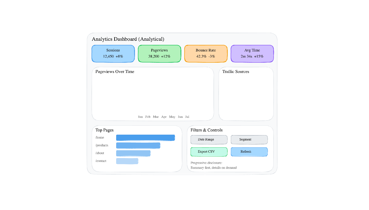
12. Dashboards for Decision-Making
A dashboard is a persistent, multi-chart display designed for ongoing monitoring and analysis. Unlike a one-time report or presentation, a dashboard is meant to be viewed repeatedly — daily or even continuously. This creates specific design constraints that one-off charts do not have.
Design Principles
- Visual hierarchy: The most important metrics should be the most visually prominent. KPI cards at the top, detailed charts below.
- Progressive disclosure: Show summary first, detail on demand. Don't front-load every chart on one screen.
- Consistent color: The same color should mean the same thing everywhere. If blue is "Chrome" in one chart, it should be "Chrome" in every chart.
- Appropriate chart types: Use the chart type inventory from Section 6. Do not use a pie chart where a bar chart would be more readable.
- The five-second test: A new viewer should be able to identify the dashboard's purpose and main finding within five seconds.
| Dashboard Type | Purpose | Update Frequency | Example |
|---|---|---|---|
| Operational | Monitor real-time system health | Seconds to minutes | Server error rates, active users, API latency |
| Analytical | Explore trends and patterns | Daily or weekly | Traffic trends, conversion funnels, A/B test results |
| Strategic | Track high-level business KPIs | Weekly or monthly | Revenue, user growth, retention cohorts |
Anti-Patterns
- The "everything" dashboard: 20+ charts on one screen. If everything is highlighted, nothing is highlighted.
- Pie overload: Multiple pie charts side by side. The viewer cannot compare angles across separate circles.
- Decorative gauges: Gauges that use a large amount of screen space to display a single number that a KPI card could show in 1/10 the space.
- No comparison period: Showing "12,450 sessions" without indicating whether that is up, down, or flat relative to last period.
- Rainbow colors: Using every color in the palette with no semantic meaning. Colors should encode data, not decorate.
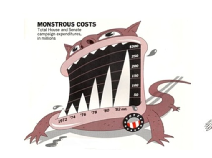
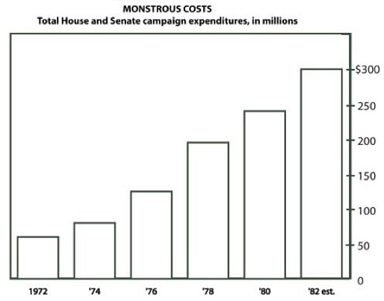
13. When Visualizations Mislead
Visualization can mislead — sometimes deliberately, sometimes through ignorance. Understanding the most common techniques is essential both for avoiding them in your own work and for detecting them in others'.
| Technique | How It Misleads | How to Detect |
|---|---|---|
| Truncated y-axis | Starting the y-axis above zero exaggerates differences between bars | Check whether the y-axis starts at zero for bar charts |
| Aspect ratio manipulation | Stretching or compressing a line chart changes perceived slope | Check whether axes are labeled with consistent intervals |
| 3D distortion | Perspective makes front elements appear larger than back elements | If a chart is 3D, ask: does the third dimension encode data? |
| Dual y-axes | Two scales on one chart; scale choices can make any two lines appear correlated | Check both axis ranges; mentally re-scale one to the other |
| Cherry-picked time range | Choosing a start/end date that shows only a favorable trend | Ask: why does the chart start on this date? |
| Inverted axes | Flipping direction so "up" means "worse" or vice versa | Check axis direction; convention is up = more |
| Area/radius confusion | Scaling a circle by radius (2×) makes area 4× as large | Check whether bubble size is scaled by area or radius |
Interactive Demo: Truncated Y-Axis
The exact same data, rendered with two different y-axis starting points. The left chart (y starts at 0) shows the true proportion. The right chart (y starts at 95) exaggerates the differences dramatically:
The data is identical: 97, 100, 98, 102, 99. These are tiny fluctuations around 100. The honest chart makes that obvious. The truncated chart makes it look like there are dramatic swings.
14. Raw Data & Data Tables
Charts summarize; tables preserve. Both are essential, and a complete analytics interface provides both.
A chart is a lossy compression of data — it shows patterns at the cost of individual values. A table preserves every value but obscures patterns. The two formats are complementary, and the best practice is to provide both: the chart for pattern recognition, the table for value lookup and verification.
This is also an accessibility issue. Screen readers cannot interpret a <canvas> element (Chart.js) or an <svg> element (D3) in any meaningful way. A data table provides the same information in a format that assistive technology can read. A chart without a corresponding data table is inaccessible by default.
Here is the pattern: a chart and its paired data table:
<!-- Chart for visual pattern recognition -->
<canvas id="pageviewChart"></canvas>

<!-- Data table for accessibility and exact values -->
<table>
  <caption>Pageviews by Page (Last 7 Days)</caption>
  <thead>
    <tr><th>Page</th><th>Pageviews</th><th>% of Total</th></tr>
  </thead>
  <tbody>
    <tr><td>/home</td><td>420</td><td>27.1%</td></tr>
    <tr><td>/blog</td><td>350</td><td>22.6%</td></tr>
    <tr><td>/pricing</td><td>310</td><td>20.0%</td></tr>
    <tr><td>/about</td><td>280</td><td>18.1%</td></tr>
    <tr><td>/contact</td><td>190</td><td>12.3%</td></tr>
  </tbody>
</table>

<!-- Minimum viable data access -->
<a href="/api/pageviews.csv" download>Download CSV</a>
And here it is rendered — the chart and the data table together, each doing what the other cannot:
| Page | Pageviews | % of Total |
|---|---|---|
| /home | 420 | 27.1% |
| /blog | 350 | 22.6% |
| /pricing | 310 | 20.0% |
| /about | 280 | 18.1% |
| /contact | 190 | 12.3% |
The chart instantly reveals that /home dominates and the distribution tapers. The table gives you exact numbers. Together, they are a complete picture — neither alone is sufficient.
Tables as Read-Only Inspection Tools
In analytics, tables are reading tools, not editing tools. You are not building a spreadsheet — you are building a viewer that lets analysts inspect the data behind charts. There are three archetypal table views:
- Raw log viewing — every pageview with timestamp, URL, CWV metrics, referrer
- Aggregated summary — pageviews per page with average LCP, total sessions
- Drill-down detail — click a chart segment to see the individual records behind that aggregate
Interactive Table Features
A static HTML table works for small datasets. For analytics dashboards with hundreds or thousands of records, interactive features are essential:
| Feature | What It Does | Analytics Use Case |
|---|---|---|
| Column sorting | Click header to sort asc/desc | Find slowest pages, top referrers |
| Filtering / search | Narrow rows to matching criteria | Find errors from a specific URL |
| Column toggle | Show/hide columns | Focus on timing metrics vs. traffic metrics |
| Pagination | Page through large result sets | Navigate thousands of pageviews |
| Virtual scrolling | Render only visible rows in DOM | Handle 10K+ rows without DOM explosion |
| Frozen columns | Lock left columns while scrolling right | Keep URL visible while scanning metrics |
| Conditional styling | Color cells based on value | Red for CLS > 0.25, green for good LCP |
| CSV/JSON export | Download visible/filtered data | Share findings with team |
Chart-to-Table Drill-Down
The most important UX pattern in analytics dashboards: clicking a chart segment filters a detail table to the matching records. The user sees an aggregated chart (overview), clicks a segment (zoom and filter), and inspects individual rows (details on demand).
// Chart.js onClick handler
onClick: (event, elements) => {
    if (elements.length > 0) {
        const url = chart.data.labels[elements[0].index];
        // Filter table to records matching this URL
        filteredData = allData.filter(r => r.url === url);
        renderTable(filteredData);
    }
}
Progressive Enhancement for Tables
Start with what works everywhere and layer interactivity on top:
- Semantic HTML
<table>— works without JavaScript, accessible to screen readers, printable - Vanilla JavaScript — add sorting, filtering, and pagination with zero dependencies
- Grid component — optionally upgrade to a library (ZingGrid, AG Grid) for advanced features like virtual scrolling, column management, and inline editing
<table> + <tr> + <td> (or ARIA equivalents). Semantic markup is the accessibility baseline. Build from this foundation, not around it.When Tables Replace Charts
Some data is better presented as a table than as a chart:
- Small datasets — a chart adds visual overhead without aiding pattern recognition
- Heterogeneous columns (URL, timestamp, user agent, error message) — no shared quantitative axis
- Exact-value lookup tasks ("What was the LCP for /checkout on Jan 15?") — charts sacrifice precision for pattern
Table Accessibility
<caption>for table identity,<th scope="col">for header–cell associationaria-sorton sortable headers to announce current sort statearia-live="polite"region to announce filter result counts
<table> with <div>-based grids for styling flexibility. Without explicit ARIA roles (role="grid", role="row", role="gridcell"), screen readers cannot navigate the data. Verify ARIA output before choosing a library.15. Data Literacy
Visualization quality has two sides: the chart-maker's skill and the chart-reader's literacy. Even a perfectly honest chart can be misread by a viewer who lacks basic data literacy skills. This is not an abstract concern — data illiteracy is the norm, not the exception, in most organizations.
Data literacy is the ability to read, interpret, and critically evaluate data presentations. It includes:
- Reading axes (what are the units? what is the scale?)
- Understanding sample size (is n=10 or n=10,000?)
- Recognizing the difference between correlation and causation
- Asking "compared to what?" (a number without context is meaningless)
- Noticing what is not shown (survivorship bias, selection effects)
Questions to Ask When Reading Any Chart
Use this checklist whenever you encounter a data visualization, whether in a news article, a dashboard, or a colleague's presentation:
| # | Question | What to Look For |
|---|---|---|
| 1 | What are the axes? | Labels, units, scale (linear vs log) |
| 2 | Does the y-axis start at zero? | For bar charts, truncation exaggerates differences |
| 3 | What is the sample size? | "Conversion rate up 50%" might mean 2 users became 3 |
| 4 | What time period is shown? | Cherry-picked date ranges can create false narratives |
| 5 | Compared to what? | A number without a baseline or comparison period is meaningless |
| 6 | Is this correlation or causation? | Two lines moving together does not mean one causes the other |
| 7 | What is not shown? | Survivorship bias, excluded data, missing categories |
| 8 | Who made this and why? | Advocacy charts (marketing, politics) have different incentives than analytical charts |
| 9 | Can I access the raw data? | Claims that cannot be verified should be treated with caution |
| 10 | Would a different chart type change the story? | If the encoding choice seems designed to emphasize a point, consider alternatives |
16. Interactive Demo: D3 in Action
D3 (Data-Driven Documents) does not give you chart types — it gives you primitives: scales, axes, shapes, selections, transitions. You build charts from these primitives, which means you can build anything, but you build everything from scratch.
The demo below is a radial lollipop chart — a visualization that no declarative charting library provides. Each spoke radiates from the center, its length proportional to pageviews, with a circle at the tip. Click "Shuffle Data" to trigger animated transitions where every spoke smoothly re-orients to its new value. Try hovering over the circles for exact values.
This chart requires manual polar coordinate math — converting angles and radii to (x, y) positions, drawing lines from center to computed endpoints, and placing circles at those endpoints. Chart.js has no "radial lollipop" type. D3 does not either — but D3 gives you the scales and trigonometry helpers to build one:
const pages = ['/home', '/blog', '/pricing', '/about', '/contact',
               '/docs', '/signup', '/checkout'];
const cx = width / 2, cy = height / 2;

// Radial scale: pageviews → spoke length
const r = d3.scaleLinear().domain([0, maxViews]).range([innerR, outerR]);

// Angular scale: page index → angle in radians
const angle = d3.scalePoint().domain(pages).range([0, 2 * Math.PI]).padding(0.5);

// Polar → Cartesian
function polarX(a, rad) { return cx + rad * Math.sin(a); }
function polarY(a, rad) { return cy - rad * Math.cos(a); }

// Draw spokes (lines from center to data point)
svg.selectAll('.spoke').data(data).join('line')
    .attr('x1', d => polarX(angle(d.page), innerR))
    .attr('y1', d => polarY(angle(d.page), innerR))
    .transition().duration(800)
    .attr('x2', d => polarX(angle(d.page), r(d.views)))
    .attr('y2', d => polarY(angle(d.page), r(d.views)));

// Draw circles at spoke tips
svg.selectAll('.dot').data(data).join('circle')
    .transition().duration(800)
    .attr('cx', d => polarX(angle(d.page), r(d.views)))
    .attr('cy', d => polarY(angle(d.page), r(d.views)))
    .attr('r', 6);
Notice what is happening: there is no type: 'radialLollipop'. You compute angles, convert polar to Cartesian, draw SVG <line> and <circle> elements, and animate them with transitions. This is the power — and the cost — of imperative visualization.
17. Visualization in the Analytics Pipeline
Visualization is not a standalone activity — it is the final stage of a pipeline that begins with data collection. Every stage upstream affects what you can visualize downstream:
If the collector does not capture a dimension (e.g., screen resolution), you cannot visualize it. If the processing stage drops malformed events, those events disappear from the charts. If the database schema does not support a particular aggregation, the query cannot produce it. Visualization quality is bounded by upstream data quality.
This is why the data quality and interpretation pitfalls sections of the Behavioral Analytics overview are essential reading even for someone focused on visualization. A beautiful chart built on garbage data is worse than no chart at all — it creates false confidence.
The pipeline also has a feedback loop: the decisions you make based on visualizations should inform what you collect next. If the dashboard reveals that users drop off on the checkout page, you might add more granular event tracking to that page. If you discover that a particular browser has high error rates, you might add browser-specific performance metrics to the collector. Everything upstream exists to serve the visualization moment — and the visualization moment exists to serve the decision.
18. Summary
Key Terms
| Term | Definition |
|---|---|
| Visual encoding | Mapping data values to visual properties (position, length, color, etc.) |
| Decoding | The viewer's process of extracting data values from visual marks |
| Anscombe's Quartet | Four datasets with identical statistics but different visual patterns; demonstrates the necessity of plotting data |
| Cleveland & McGill ranking | Empirical hierarchy of perceptual accuracy: position > length > angle > area > color |
| Exploratory visualization | Charts made for the analyst to discover unknowns; messy, fast, disposable |
| Explanatory visualization | Charts made for an audience to communicate knowns; polished, annotated, focused |
| Declarative charting | Specify what you want (config object); library handles rendering (Chart.js, Highcharts) |
| Imperative charting | Specify how to draw each element (selections, bindings, attributes); D3.js |
| Martini Glass | Narrative structure: author-driven → conclusion → reader-driven exploration (Segel & Heer 2010) |
| Dashboard | Persistent multi-chart display for ongoing monitoring and decision support |
| Progressive disclosure | Showing summary first, detail on demand; avoids information overload |
| Truncated y-axis | Starting the y-axis above zero; exaggerates differences in bar charts |
| Chartjunk | Visual elements that do not encode data: 3D effects, gradients, decorative icons (Tufte) |
| Data literacy | Ability to read, interpret, and critically evaluate data presentations |
| Data availability | Principle that the raw data underlying a visualization should be accessible for verification |
| Rendering surface | Technology for drawing charts: static image, CSS, Canvas, SVG, or WebGL/WebGPU |
| Immediate mode | Rendering model where draw commands produce pixels and shapes have no persistent identity (Canvas, WebGL) |
| Retained mode | Rendering model where elements persist as DOM nodes tracked by the browser (SVG, CSS/HTML) |
| Hybrid rendering | Server aggregates data, client renders charts; avoids sending raw data to browser |
| Client-side rendering | Browser renders charts from JSON data using Canvas or SVG |
| Server-side rendering | Server generates chart images (PNG/SVG) and sends them to the browser |
| Grammar of Graphics | Formal system decomposing charts into layers, scales, and coordinates (Wilkinson 1999; D3, Vega) |
| KPI card | Dashboard element showing a single key metric with trend indicator |
| Sparkline | Small inline chart showing trend shape without axes; fits within text or table cells |
| Dual y-axes | Two scales on one chart; scale choices can fabricate apparent correlation |
| Survivorship bias | Analyzing only data that "survived" a selection process; missing the failures |
| Five-second test | A new viewer should identify a dashboard's purpose within five seconds |
| Correlation vs. causation | Two variables moving together does not mean one causes the other |
| Data table | Tabular display of individual records complementing aggregated charts; primary tool for data inspection |
| Drill-down | Clicking a chart element to reveal the detail rows behind that aggregate |
| Virtual scrolling | Rendering only visible rows in the DOM to handle large datasets without performance degradation |
| Progressive enhancement (tables) | Starting with semantic HTML <table> and layering interactivity (sort, filter, paginate) via JavaScript |
| Wire format | Data serialization format for network transfer: JSON, CSV, NDJSON, MessagePack, Apache Arrow, Protocol Buffers |
| Parse-all-or-nothing | JSON's structural requirement that the entire payload be received and parsed before any data is accessible |
| Zero-copy parsing | Reading data directly from a network buffer without deserialization; Apache Arrow's key advantage at scale |
| Server-side aggregation | Reducing raw records to summary rows (GROUP BY) on the server before transfer; the primary strategy for controlling payload size |
Section Summary
| # | Section | Key Point |
|---|---|---|
| 1 | Why Visualize Data? | Human vision processes patterns faster than reading tables; Anscombe's Quartet proves statistics alone are insufficient |
| 2 | Visual Encoding | Charts map data values to visual channels; not all channels are equally accurate |
| 3 | Decoding & Perception | Position > length > angle > area > color; this is measured, not opinion |
| 4 | Exploratory vs. Explanatory | Exploration discovers unknowns; explanation communicates knowns; don't conflate them |
| 5 | Chart Conventions | Charts are shared visual language inherited from 240 years of practice; breaking convention has a cost |
| 6 | Chart Type Inventory | Choose chart type by the question being asked, not by appearance preference |
| 7 | Client vs. Server Charting | Client-side is interactive but requires data transfer; at scale, transfer and parse time dwarf render time; hybrid aggregation is the answer |
| 8 | Rendering Technologies | Five surfaces (image, CSS, Canvas, SVG, WebGL); immediate vs retained mode; performance envelopes determine choice |
| 9 | Declarative vs. Coded | Declarative (Chart.js) is fast; imperative (D3) is powerful; use both for different purposes |
| 10 | Encoding Demo | Same data, different encodings, different stories; encoding choice is editorial choice |
| 11 | Data Storytelling | Data + visual + narrative; Martini Glass structure guides then opens to exploration |
| 12 | Dashboards | Visual hierarchy, progressive disclosure, consistent color; a dashboard that shows everything shows nothing |
| 13 | Misleading Visualizations | Truncated axes, 3D distortion, cherry-picked ranges; know the techniques to avoid and detect them |
| 14 | Raw Data & Tables | Tables complement charts: drill-down, raw inspection, sorting, filtering, progressive enhancement from static HTML to interactive grid |
| 15 | Data Literacy | The greatest risk is an honest chart + illiterate viewer; data literacy is a defensive skill |
| 16 | D3 Demo | D3 gives you primitives (scales, selections, transitions), not chart types; unlimited ceiling, steep curve |
| 17 | Analytics Pipeline | Visualization is the last mile; quality bounded by upstream data quality; everything upstream serves this moment |
Data visualization is where the analytics pipeline meets human cognition. Every chart is an encoding choice, every encoding choice is an editorial decision, and every editorial decision shapes the viewer's understanding. The ability to create honest, effective visualizations — and to critically read others' visualizations — is not a nice-to-have skill for web engineers. It is a core competency in a world that increasingly claims to be "data-driven."